Designers
Developers
About
Motion guidelines
Icon guidelines
App launcher icons
- Tools and Artefacts
- Coming soon!
- Getting started
- Designers
- Developers
- About
- Explore Getting started
- Designers
- Developers
- About
- Motion guidelines
- Icon guidelines
- App launcher icons
- Components
- Explore Components
Web components
Essential guidelines for creating cohesive and accessible digital experiences.
- Content
- Controls
- Inputs
- Navigation
Content
Controls
Inputs
Navigation
Content
Components are one of the key building blocks of the design system. Their systematic reuse helps to create visual and functional consistency across products.

Accordion
An accordion collapse and expands sections of related content.

Notes
Concise, structured information piece used for quick reference.
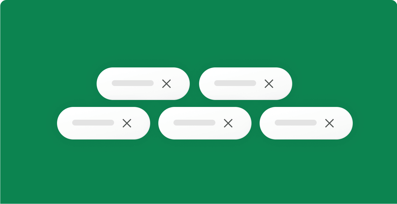
Tags
Labels in digital UI that categorise, organise, or add context to elements.

Modal
Modals let users confirm or view extra content without losing page context.
Cards
Displays detailed content, grouping info for users to view upon clicking.

List Item
Use to present simple pieces of information
Controls
Components are one of the key building blocks of the design system. Their systematic reuse helps to create visual and functional consistency across products.
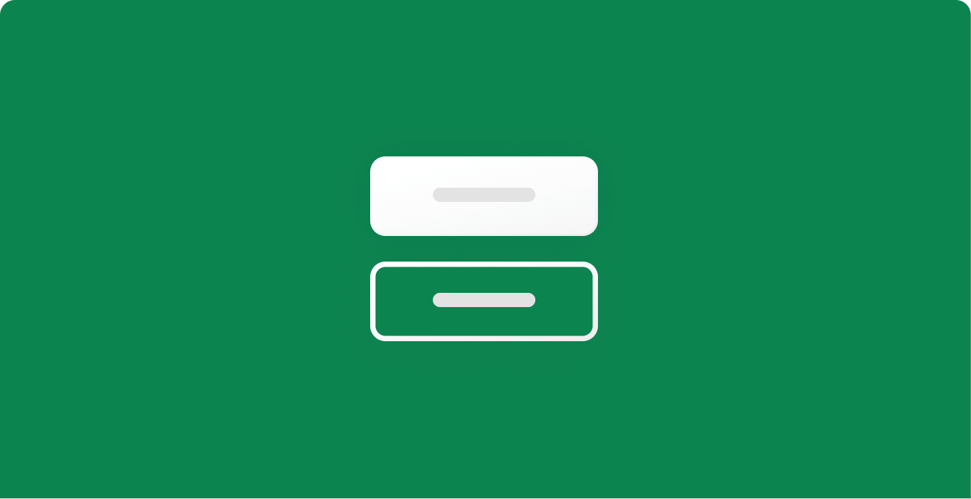
Buttons
Interactive elements users click or tap to trigger actions
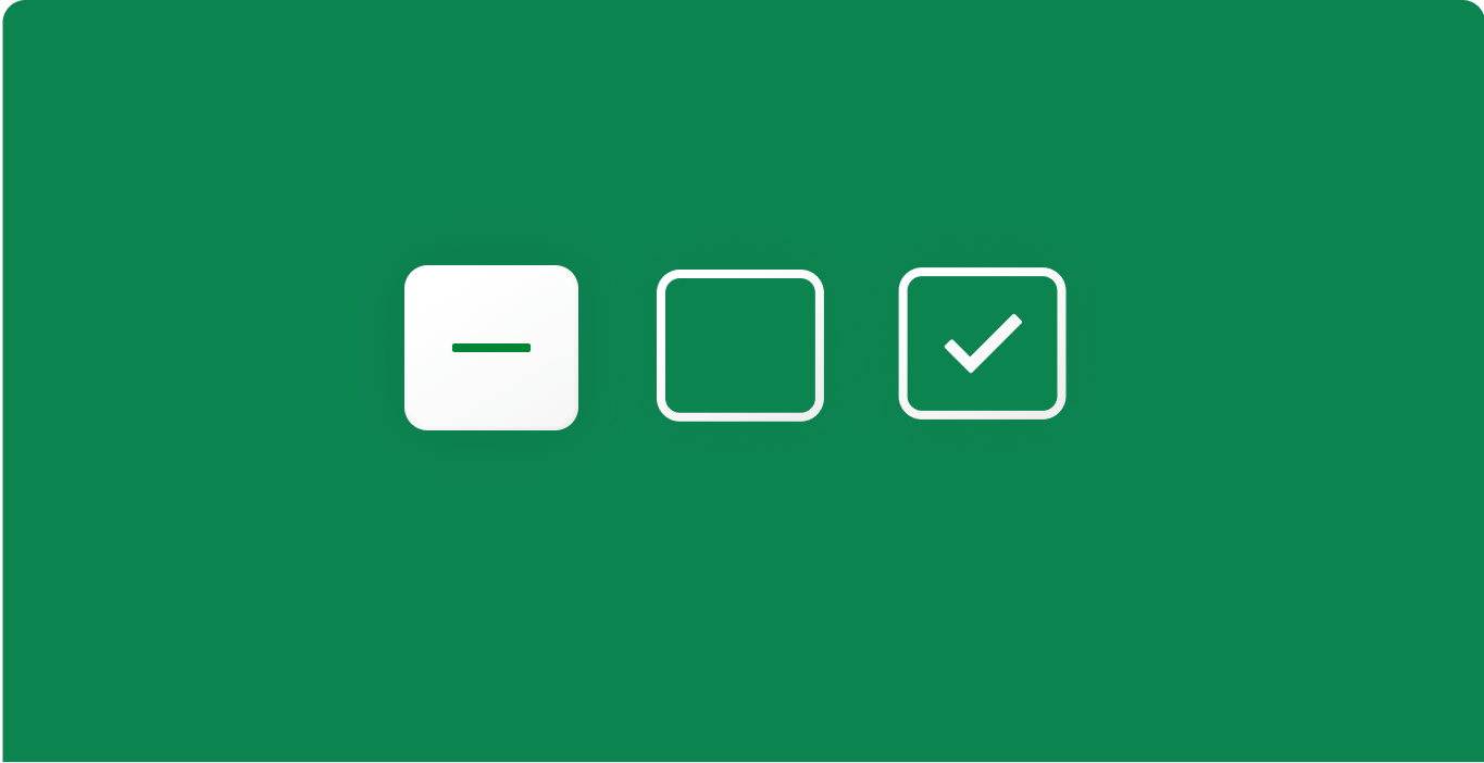
Checkboxes
Element that allows users to select one or more options from a set.
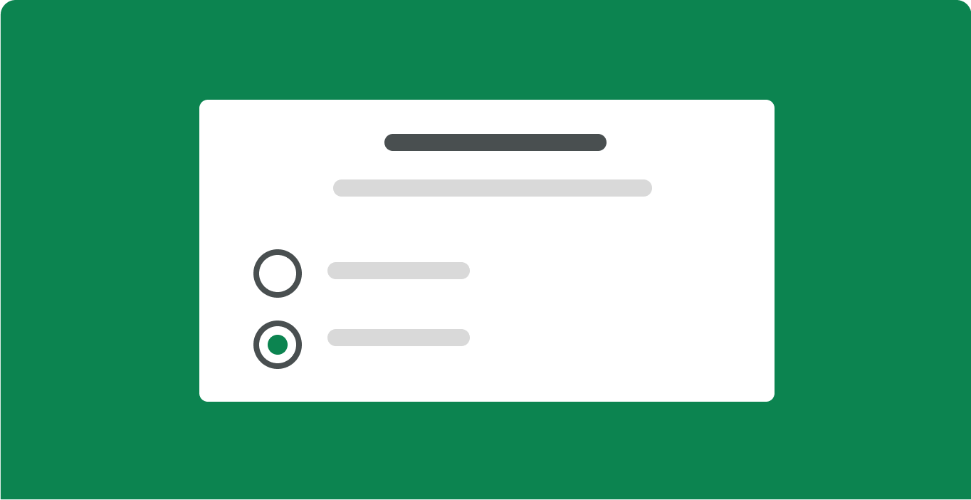
Radio Buttons
Allows to select one option out of a predefined list of 6 or fewer options.

Toggle
Lets users instantly switch between two states.
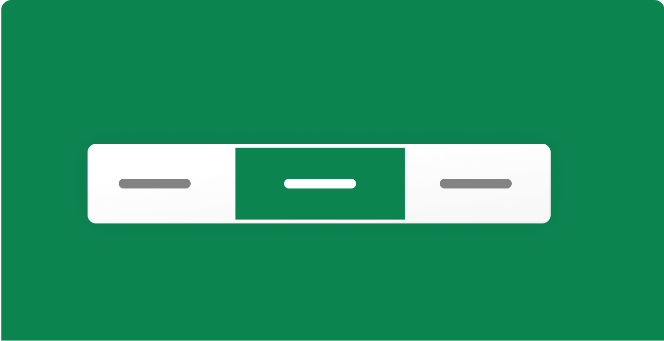
Switch Field
Sections off content on pages, helping users access relevant information.

Range Slider
A range of values along a bar, allowing users to select predefined increments.
Inputs
Components are one of the key building blocks of the design system. Their systematic reuse helps to create visual and functional consistency across products.

Input
An input field lets the user enter a single line of text.
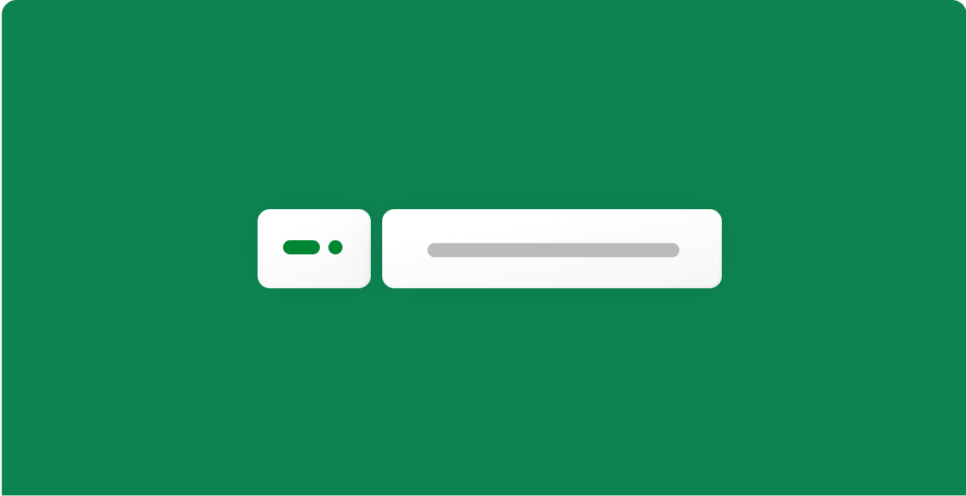
Phone Number Input
A phone number input field lets the user enter numbers.
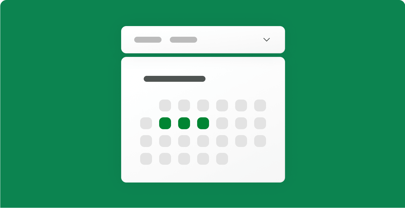
Date Picker
Lets the user select a date value. You can select a single date or date range.
Text Area
A text area allows the user to enter a large amount of text.
Number Scrubber
Number scrubbers are used to change or select number values.
File Upload
Allows users to upload one or more files at once.
Navigation
Components are one of the key building blocks of the design system. Their systematic reuse helps to create visual and functional consistency across products.
Pagination
Show expectations and exit options.
Navigation bar
Lets users navigate different sections of an application or website.
Footer
An element at the bottom of a website or an app that usually has secondary navigation.

Hyperlink
A text-based link, usually underlined, that is used on its own or inline.
Tabs
A navigation element that lets users access different site areas or page sections.
Top Bar
A horizontal menu at the top of a page for quick access to key sections.