- Get set up
- Design resources
New to Elements Design System? This checklist will get you started confidently and effortlessly.

Step 1: EDS foundations – Brand and guidelines
Familiarise yourself with the brand CI guidelines. The design language of Nedbank is the visual expression of our brand, encompassing color, type scale, the grid, and more. Our design system translates the design language into code that enables us to create cohesive digital experiences. Through elements like color tokens, type tokens, and spacing tokens, you can seamlessly apply these design principles across all digital platforms.
Step 2: Get the right tools – Figma
All Nedbank designers have a licence for Figma, our primary design kit tool. Although you can still access older tools like Sketch, Adobe XD and Axure via the Design Toolbox, we no longer maintain or update these kits. Migrate to Figma to access our most current and comprehensive design kits and ensure you stay ahead with the latest updates
Step 3: Use the core design kits in
The core design kits are maintained in Figma. These kits include all the essential components and styles for creating product and web experiences. By using these kits, you’ll automatically receive design library updates, keeping your designs aligned with the latest releases. This ensures a unified language among designers and shared functionality expectations with developers during handover and development cycles. Visit the Design kits section and follow the Figma setup instructions.

Step 4: Review usage guidance
Explore the components and patterns documentation to gain a deep understanding of the system. EDS offers comprehensive design usage and style guidance for all components, along with a range of key patterns ,which are the best practice solutions for user goals. These patterns are vetted, reviewed and approved for use by the Design System Team, ensuring you design with confidence.

Step 5: Collaborate with the Design System Team
If you are a Nedbanker and you have any questions about the kits or tools, connect with us on Teams: Design System Queries. Alternatively, you can send your support request via email and receive feedback within a day.
Need help? Get in touch.
For help or if you want to collaborate with the Design System Team, please reach out to them via the following channels:
Email: elements@nedbank.co.za
Teams: Design system — Queries
Design resources
Welcome to the heart of the design resources! Here, you’ll find a curated collection of essential kits and libraries tailored for designers like you. Whether you need of illustrations, icons, color palettes, typography, or design tokens, we have you covered. Explore our comprehensive libraries and the kits compiled for various platforms and digital products, ensuring you have all the components you need to bring your digital experiences to life.
Design libraries
Colour library
Browse our extensive color palettes.
Type library
Access a variety of typography options.
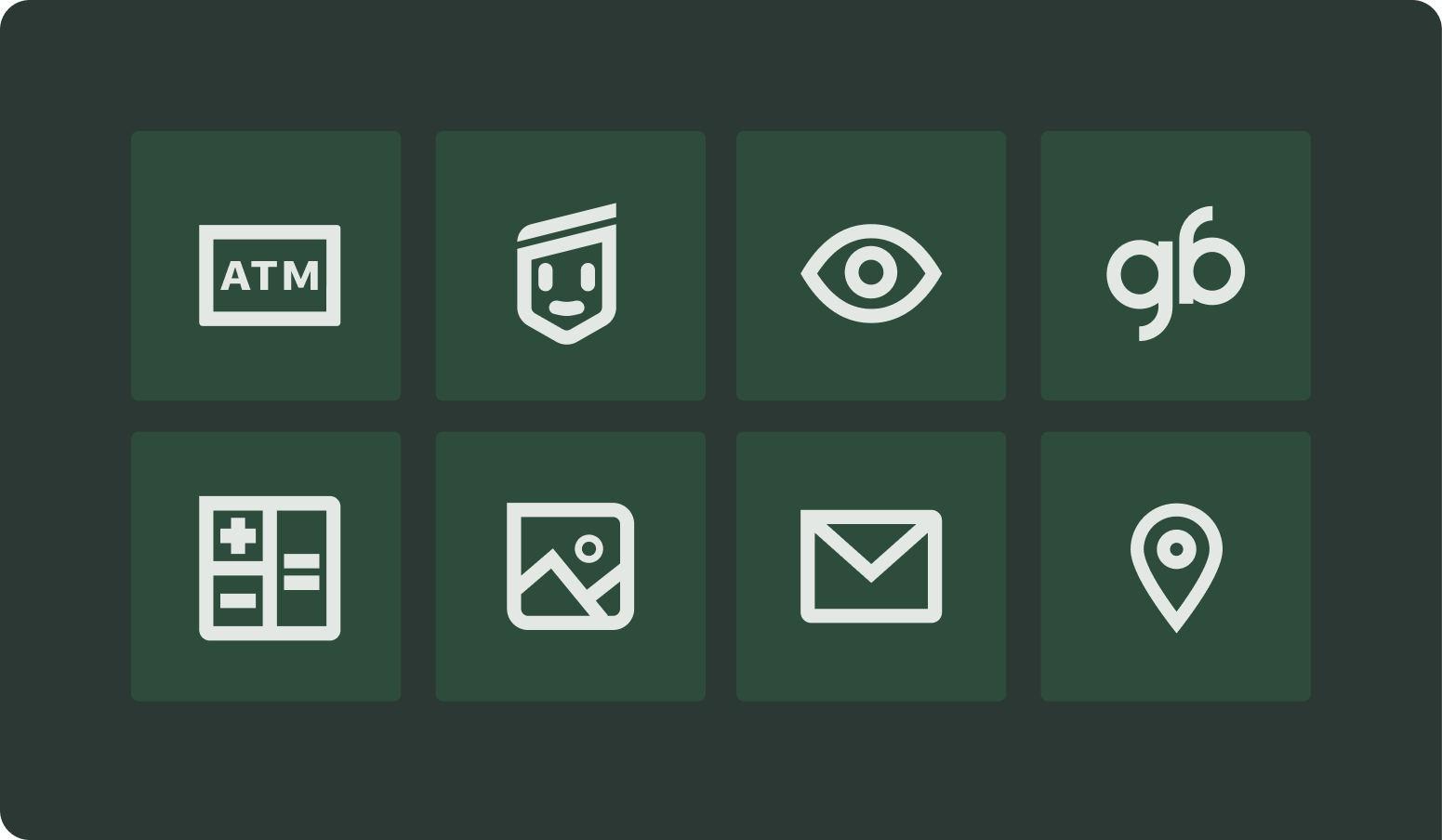
Token library
Find essential design tokens here.
UI kits and libraries
Self-service kiosk library
Find the components for self-service kiosks here.
ATM library
Find the components for ATMs here.
Brand Refresh library
Find the components for the Nedbank web page here.
Current web – UI kit
Find the core components for the Nedbank web page brand here.
NBH web – UI kit
Find the core components for the Nedbank Business Hub here.
NBH web – component library
Find the components for the Nedbank Business Hub(NBH) here.
Need help? Get in touch.
For help or if you want to collaborate with the Design System Team, please reach out to them via the following channels:
Email: elements@nedbank.co.za
Teams: Design system — Queries
